Build a Touch UI
You've blinked an LED — now build something you can touch. This tutorial walks you through a complete touch application: a tap counter with a second page you can navigate to and back, with the screens laid out visually in the TinyCLR UI Designer. About 20 minutes.
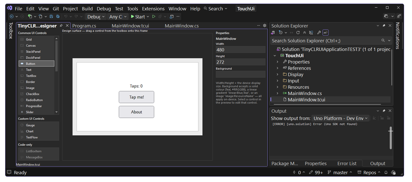
Along the way you'll meet the four pieces every TinyCLR touch UI is made of:
- Displays — configure and enable the panel.
- Font Support — nothing renders text without a font resource.
- User Interface — the WPF-inspired framework of windows, panels, and controls.
- Touch Screen — the capacitive touch driver that feeds input to the UI.
Each step links to the matching reference page for depth and for other hardware.
This tutorial assumes you've finished TinyCLR Getting Started — that page installs the tools, flashes firmware, and deploys your first program. Everything here builds on it.
You'll also need:
- The getting started steps completed — IDE installed and firmware flashed. This tutorial creates a project of its own, so there's no need to keep the getting-started project around.
- An SCM20260D Dev Board with the 4.3" parallel display (480×272, capacitive touch) — or a FEZ Portal, the all-in-one SBC with the same display built in. The only code difference between the two is the touch interrupt pin (see Step 1).
- Visual Studio — the TinyCLR UI Application project template and the UI Designer used in this tutorial are both Visual Studio-only.
Using a different board or panel? The structure of this tutorial is the same — swap the display timing values and pin names using Displays and your board's pinout.
Step 1 — Create the project
Visual Studio has a project template built for exactly this: TinyCLR UI Application. Create a new project → pick TinyCLROS from the Platforms dropdown → select TinyCLR UI Application → Next.
It starts you off with everything a touch UI needs already wired up:
- NuGet packages — display, GPIO, I²C, pins, the UI framework (which pulls in the drawing library), and the FocalTech FT5xx6 touch driver are all referenced already.
Program.cs— powers the backlight, configures the 4.3" panel (480×272), and wires the FT5xx6 touch controller'sTouchDown/TouchUpevents intoMainApp.InputProvider.RaiseTouchviaInitializeTouch(). Defaults target the SCM20260D Dev Board; on a FEZ Portal, change the interrupt pin inInitializeTouch()fromPJ14toPG9— everything else is identical. Other panels, timings, and resistive touch are covered on Displays and Touch Screen.MainWindow.tcui/MainWindow.cs— a starter Designer screen. Step 3 turns it into the tap counter.
Step 2 — Fonts
Nothing renders text without a font. TinyCLR fonts are binary resources embedded in the project, and the TinyCLR UI Application template already includes two ready to use — droid_reg10 and droid_reg12, listed in Resources.resx. The UI Designer's generated code loads them automatically for text elements, so there's nothing to set up for this tutorial.
Need a different size, typeface, or character range? See Font Support for converting and adding your own.
Step 3 — Design the first page
The screens themselves come from the TinyCLR UI Designer rather than hand-built element trees. Each screen is a .tcui file — a WPF-flavored XML description of the element tree — paired with a C# code-behind class. A live preview renders the markup as you edit, and the build generates the InitializeComponent() that constructs the elements on the device.
Open the screen the template already added. MainWindow.tcui and its code-behind, MainWindow.cs, were created for you along with the project — seeded with a placeholder Text and Button to prove the pipeline works. There's no new item to add; select MainWindow.tcui in the Solution Explorer, click the TinyCLR UI Designer tab, and replace the placeholder — drag a Text and Button element from the toolbox onto the canvas, or edit the .tcui file directly; the UI Designer updates any manual changes made. However you get there, make MainWindow.tcui read:
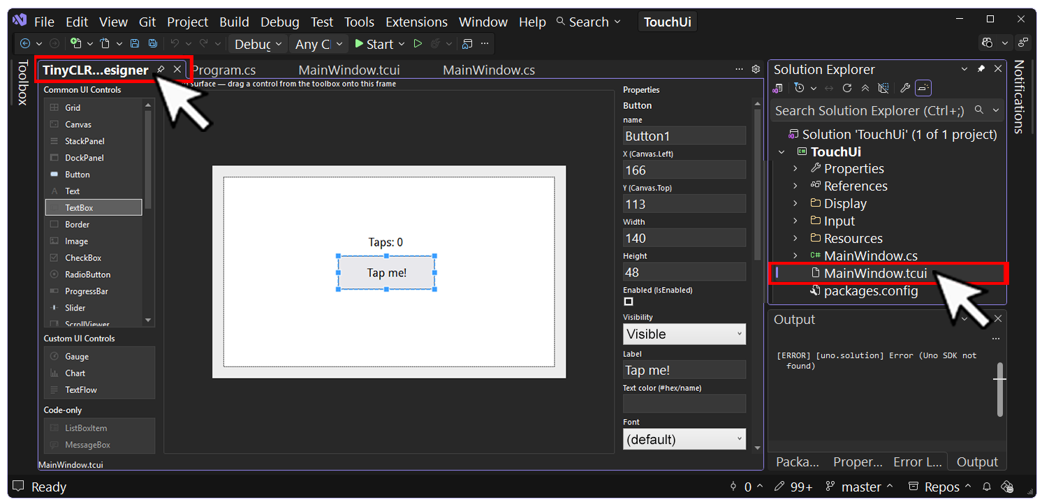
<Window Class="TouchUi.MainWindow" Width="480" Height="272">
  <Canvas Name="RootCanvas">
    <Button Name="Button1" Width="140" Height="48"
        TabIndex="0" IsTabStop="true"
        Canvas.Left="166" Canvas.Top="113"
        HorizontalContentAlignment="Center" Click="TapButton_Click">
      <Text TextContent="Tap me!" />
    </Button>
    <Text Name="TapsLabel" TextContent="Taps: 0" Width="176" Height="26"
        TextAlignment="Center"
        Canvas.Left="148" Canvas.Top="79" />
  </Canvas>
</Window>
Four conventions are doing the work here (the full list is in the Designer reference):
- The root is a
Window— a complete screen. Constructing aWindowregisters it with the window manager, so it's shown directly — never nested inside another window or element. Classnames the partial class the build generates from this markup. Use your project's default namespace in place ofTouchUi.Nameturns an element into a private field the code-behind can use —Name="TapsLabel"becomes_tapsLabel.Click="TapButton_Click"wires the button to a handler you write in the code-behind.
Text elements automatically use the template's built-in font (Step 2) — the generated code loads it for you.
The code-behind. Clicking an element in the UI Designer creates its event handler in MainWindow.cs. Fill in the tap counter — the count lives in an instance field on the page:

using GHIElectronics.TinyCLR.UI;

namespace TouchUi {
    public partial class MainWindow : Window {
        private int taps;

        public MainWindow() {
            InitializeComponent();
        }

        private void TapButton_Click(object sender, RoutedEventArgs e) {
            taps++;
            _tapsLabel.TextContent = "Taps: " + taps;
            _tapsLabel.Invalidate();
        }
    }
}
Show it. The screen is a window — run it directly. In Program.cs, add a field for the page:
public static MainWindow Counter;
then replace the template's MainApp.Run(new MainWindow()); at the end of Main with:
        Counter = new MainWindow();

        MainApp.Run(Counter);
A Designer screen can never be another window's Child — as a Window it already belongs to the window manager, and nesting it throws ArgumentException: element has parent. Run it directly, or show and hide it as in Step 4.
Click fires on the UI thread, so updating the label directly is safe here. Updating elements from a timer or another thread requires Dispatcher.Invoke — see User Interface → The Dispatcher.
Step 4 — Design the second page
Each Designer screen is a full window, and the window manager shows whatever is visible — so "navigating" means hiding the current screen and showing another. Add a field for the second page and a small navigation helper to Program:
public static AboutPage About;

static Window current;

public static void Navigate(Window page) {
    if (current == page)
        return;

    current.Visibility = Visibility.Hidden;
    current = page;
    current.Visibility = Visibility.Visible;
    current.Invalidate();
}
then create the About page alongside the counter page at the end of Main, hidden until it's navigated to:
        Counter = new MainWindow();
        About = new AboutPage();
        About.Visibility = Visibility.Hidden;
        current = Counter;

        MainApp.Run(Counter);
Design the About screen. Add another TinyCLR UI Screen named AboutPage — a title and a Back button:
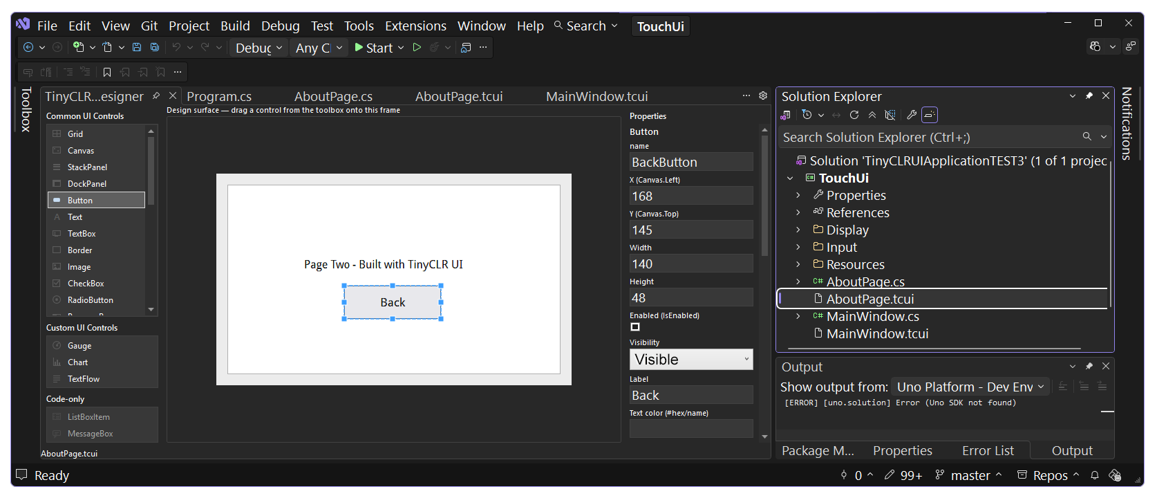
<Window Class="TouchUi.AboutPage" Width="480" Height="272">
  <Canvas Name="RootCanvas">
    <Text Name="TitleLabel" TextContent="Page Two - Built with TinyCLR UI" Width="260" Height="29"
        TextAlignment="Center"
        Canvas.Left="110" Canvas.Top="104" />
    <Button Name="BackButton" Width="140" Height="48"
        TabIndex="0" IsTabStop="true"
        Canvas.Left="168" Canvas.Top="145"
        HorizontalContentAlignment="Center" Click="BackButton_Click">
      <Text TextContent="Back" />
    </Button>
  </Canvas>
</Window>
Clicking on the Back in the UI Designer creates the necessary event handler, then adding Program.Navigate(Program.Counter); to the event, sends the end-user back to the Counter page:

namespace TouchUi {
    public partial class AboutPage : GHIElectronics.TinyCLR.UI.Window {
        public AboutPage() {
            InitializeComponent();
        }

        private void BackButton_Click(object sender, GHIElectronics.TinyCLR.UI.RoutedEventArgs e) {
            Program.Navigate(Program.Counter);
        }
    }
}
Link the pages. Give the counter page an About button below the tap button — drag another Button onto MainWindow in the Designer, or add it in the markup. The addition is highlighted:
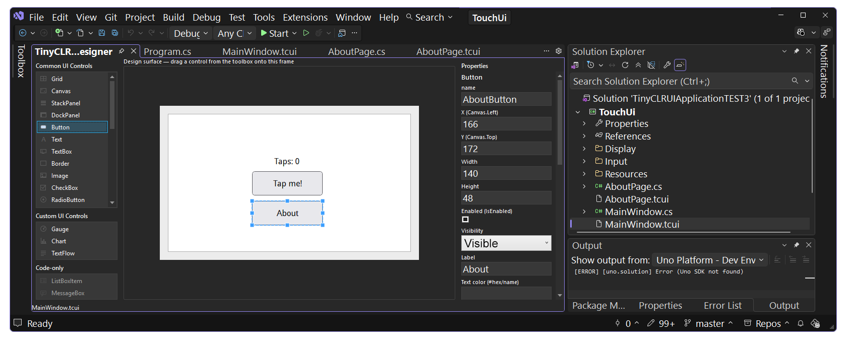
<Window Class="TouchUi.MainWindow" Width="480" Height="272">
  <Canvas Name="RootCanvas">
    <Button Name="Button1" Width="140" Height="48"
        TabIndex="0" IsTabStop="true"
        Canvas.Left="166" Canvas.Top="113"
        HorizontalContentAlignment="Center" Click="TapButton_Click">
      <Text TextContent="Tap me!" />
    </Button>
    <Text Name="TapsLabel" TextContent="Taps: 0" Width="176" Height="26"
        TextAlignment="Center"
        Canvas.Left="148" Canvas.Top="79" />
    <Button Name="AboutButton" Width="140" Height="48"
        TabIndex="0" IsTabStop="true"
        Canvas.Left="166" Canvas.Top="172"
        HorizontalContentAlignment="Center" Click="AboutButton_Click">
      <Text TextContent="About" />
    </Button>
  </Canvas>
</Window>
Then the matching handler in MainWindow.cs, the code can be added manually or by clicking the button in the UI Designer which ever method is desired:

        private void AboutButton_Click(object sender, RoutedEventArgs e) {
            Program.Navigate(Program.About);
        }
Both pages are created once at startup and shown or hidden by Navigate — that's why taps lives on the MainWindow instance and the count is still there when you come back from the About page.
Prefer plain code? The same two pages without the Designer
Everything the Designer generates can be written by hand — here a hand-built page is a method that returns an element tree, hosted in one hand-made Window whose Child gets swapped. (Child-swapping is fine here because these pages are panels, not windows.)
Skip the .tcui files — including the template's own MainWindow.tcui / MainWindow.cs, which you can delete — and the Counter/About/current members from Steps 3–4. Add using GHIElectronics.TinyCLR.UI.Media; to the usings (UI.Controls is already imported by the template) and end Main with:
        font = Properties.Resources.GetFont(Properties.Resources.FontResources.droid_reg10);

        MainApp.Run(CreateWindow(display));
Then add the fields, navigation, and page builders:
static Window window;
static Font font;
static int taps;

static void Navigate(UIElement page) {
    window.Child = page;
    window.Invalidate();
}

private static Window CreateWindow(DisplayController display) {
    window = new Window {
        Width = (int)display.ActiveConfiguration.Width,
        Height = (int)display.ActiveConfiguration.Height,
        Background = new LinearGradientBrush(Colors.Blue, Colors.Teal, 0, 0,
            (int)display.ActiveConfiguration.Width, (int)display.ActiveConfiguration.Height),
        Visibility = Visibility.Visible,
    };
    window.Child = CounterPage();
    return window;
}

private static UIElement CounterPage() {
    var panel = new StackPanel(Orientation.Vertical) {
        VerticalAlignment = VerticalAlignment.Center,
    };

    var label = new Text(font, "Taps: " + taps) {
        ForeColor = Colors.White,
        HorizontalAlignment = HorizontalAlignment.Center,
    };
    label.SetMargin(20);

    var button = new Button {
        Child = new Text(font, "Tap me!") {
            HorizontalAlignment = HorizontalAlignment.Center,
            VerticalAlignment = VerticalAlignment.Center,
        },
        Width = 140,
        Height = 48,
        HorizontalAlignment = HorizontalAlignment.Center,
    };

    button.Click += (s, e) => {
        taps++;
        label.TextContent = "Taps: " + taps;
        label.Invalidate();
    };

    var about = new Button {
        Child = new Text(font, "About") {
            HorizontalAlignment = HorizontalAlignment.Center,
            VerticalAlignment = VerticalAlignment.Center,
        },
        Width = 140,
        Height = 48,
        HorizontalAlignment = HorizontalAlignment.Center,
    };
    about.SetMargin(10);
    about.Click += (s, e) => Navigate(AboutPage());

    panel.Children.Add(label);
    panel.Children.Add(button);
    panel.Children.Add(about);
    return panel;
}

private static UIElement AboutPage() {
    var panel = new StackPanel(Orientation.Vertical) {
        VerticalAlignment = VerticalAlignment.Center,
    };

    var title = new Text(font, "Page two — built with TinyCLR UI") {
        ForeColor = Colors.White,
        HorizontalAlignment = HorizontalAlignment.Center,
    };
    title.SetMargin(20);

    var back = new Button {
        Child = new Text(font, "Back") {
            HorizontalAlignment = HorizontalAlignment.Center,
            VerticalAlignment = VerticalAlignment.Center,
        },
        Width = 140,
        Height = 48,
        HorizontalAlignment = HorizontalAlignment.Center,
    };
    back.Click += (s, e) => Navigate(CounterPage());

    panel.Children.Add(title);
    panel.Children.Add(back);
    return panel;
}
Here the pages are rebuilt on every visit, so the tap count is a static field on Program — that's what keeps the counter's value when you navigate away and back.
Step 5 — Run it
Press F5. The build first turns each .tcui into a generated partial class (MainWindow.tcui.g.cs — open it to see exactly what InitializeComponent does), then compiles and deploys. The counter page appears, and every tap of the button bumps the counter. Tap About to switch pages, Back to return — the count is still there.
If something's off:
- Blank screen — recheck the backlight pin and the timing values against your panel (Displays).
- UI shows but taps do nothing — the touch driver is interrupt-driven, so a wrong interrupt pin means zero events; verify the pin for your board (PJ14 Dev Board, PG9 FEZ Portal — see Step 1), the I²C bus, and that
TouchDown/TouchUpare wired toRaiseTouchinInitializeTouch()(Touch Screen). ArgumentException: element has parent— a Designer screen was assigned as aChild. Screens are windows: run the first one and switch withNavigate, never nest them.InitializeComponentnot found — the.tcuididn't generate; check that each file'sClassattribute matches its code-behind's namespace and class name.- A property you set in markup has no effect — the generator drops attributes the device control doesn't support, with a
// note:comment in the generated.tcui.g.cs; check there first.
Where to go next
- User Interface — the full catalog of ~30 controls (lists, sliders, gauges, charts…), hardware-button input, and layout panels.
- TabControl — a ready-made alternative to hand-rolled navigation when your pages fit a tabbed layout.
- UI Designer reference — the full
.tcuiconventions: supported elements, colors and gradients, attached properties, and how the markup maps to device controls. - Graphics — drop below the UI framework and draw shapes, text, and bitmaps directly.
- Displays — 7" panels, SPI displays, and character LCDs.